
The map that became a decision engine.
Store Locator is the surface inside the Bajaj Finserv app that helps customers find a physical place to go — an EMI partner store, a branch, a dealership, a collection centre. It spans 11 categories and one of India's largest retail-finance networks.
We reimagined it as Find & Buy: a surface that no longer answers where is it, but is it worth going — and that increasingly lets the customer finish without going at all.
Lead designer on the programme
I owned the problem framing, the research synthesis and the strategic direction, then the design of the experience itself across six business lines.
Problem framing, North Star, product direction
Stakeholder mapping, journey, blueprints
IA, interaction model, design across 6 verticals
SMT, six P&Ls, Engineering, Ops, Legal, Marketing
Metric tree, instrumented before design began
Ashish Srivastava · Bajaj Finance Limited
Three in four people who came here to find a store left without one.
We are the only party in the transaction who cannot see the transaction.
A customer browses a television on Bajaj Mall, is financed by Bajaj, buys at a Bajaj EMI partner store, and repays Bajaj for eighteen months. The only step Bajaj doesn't own is the one where they walk in. And we handed it to Google Maps, roughly a million times a month, for free.
Where the logs and the interviews disagreed, the logs won.
Two-thirds never reach a single store result.
of the people who reach a list will tap one store card. The collapse sits between seeing options and being willing to choose one.
More people tapped the exit popup that month than finished the job they came for.
Clickstream, April 2026 · 9,93,000 unique users
Four baselines. Every one of them comes back at the end of this deck.
left without reaching any store result
completed what they came for
average session length
reached the right result first try
Six beliefs went in. Five came out inverted.
| We assumed | The evidence said | Source |
|---|---|---|
| The locator is under-performing | It is under-used. 90% never knew it existed | IDI · FOS |
| Customers reject the experience | They never try it. No complaints, no demand signal | FOS · 8 agents |
| People come to find a place | They come to resolve one thing, fast. 30–60 second sessions | IDI |
| Store and branch are different journeys | 9 in 10 use the words interchangeably | IDI |
| The map is the product | The list is the decision surface. Map converts 4–5× worse | Clickstream |
| Better UI will lift conversion | UI cannot move a feature nobody knows to open | All five |
A resolver in a hurry, meeting a surface built for an explorer with time.
“Regular use nahi karta — jab due aata hai tab open karke bas dekhta hoon.”
“Bajaj branch kahaan hai woh Google se proper dikha deta hai. App mein nahi jaata.”
“Try kiya tha but apne ko nahi mila. Toh phir nearby store par jaake check kara.”
“When I'm almost about to make the payment, they say no, we don't have Bajaj.”
The live product today, and what fails at each step.
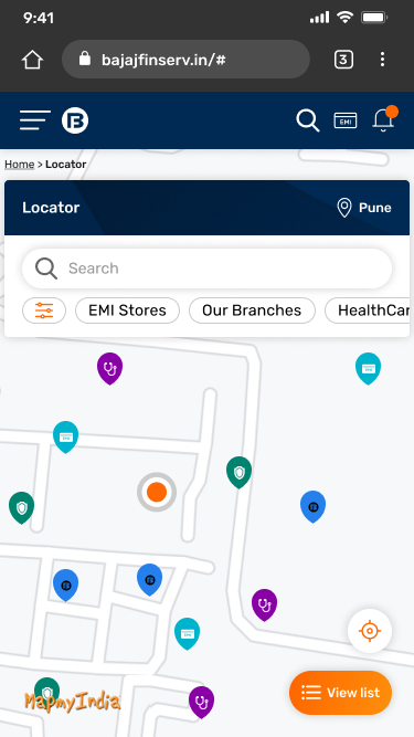
Pin colour is the only clue, and there is no legend.
Eleven categories at equal weight. No count, no radius. The chip row is clipped mid-word.
46.4% cannot map their need to a category
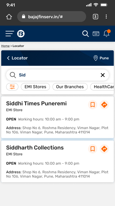
It invites you to type, then returns silence.
The index holds registered entity names, so Croma is filed as Infiniti Retail. Two results here share one address.
4.3 blank taps for every one typed
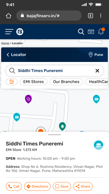
It identifies a store. It cannot enable a decision.
No hours, no ETA, no phone, no photo. Four buttons at identical weight, none of them primary.
Depth 2/5 against Google's 5/5
And the three states where the journey ends badly.
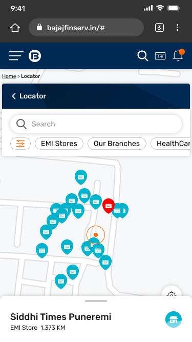
Twenty identical pins, and a drawer covering the map.
No clustering. Two shops can never be held side by side, so comparison is impossible.
Zero save or share clicks ever logged
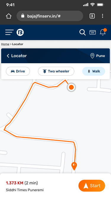
The journey is designed to end at an address.
Directions hand off, the session is over, and nothing is learned about the visit.
100% of trips finish in Google Maps
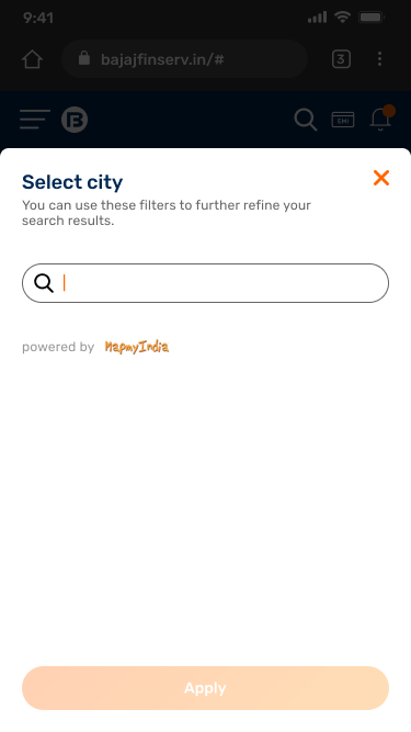
A modal you cannot leave, and a button you cannot press.
No detected location, no city list, no skip. The disabled Apply fails contrast and never says why.
100% who hit this did not return
“The Store Locator bounces. Redesign it.”
A usability problem, already diagnosed, with the remedy implied in the sentence. Taken literally it would have optimised a page for the 2% of users who open it.
Is the customer trying to find a location, or to accomplish something through one?
Answering it meant going after adoption before usability, and the ecosystem before the interface.
90% didn't know it existed · 8 of 8 agents say nobody asks · 50% phone the store before visiting, not for the address but for permission
Discovery
Answers where. Ends at an address. Measured in page views.
Intent
Ask the job, not the noun. Route to the best fulfilment path.
Decision
Answers is it worth going. Ends in an action.
Discovery is a marketing asset measured in traffic. Decision is a commerce asset measured in conversion. That reclassification changed who owned this, how it was funded, and what it could ask of six different P&Ls.
Seven ways in. Not one of them a deliberate “find a store”.
The richer the context a source carries, the worse it converts. Bajaj Mall sends the most traffic and converts stayers at 3.4%. FPS product cards, where some context survives, convert at 9.9%.
One utility, sitting across six businesses and five functions.
SMT · Product · Operations · Engineering · Legal & Compliance
B2B · Personal Loan · Gold Loan · Insurance · Investments · Business Loan
Stores · dealers · branches · collection centres
Measured on whether the trip went well — and the only actor with no seat in the room.
Every empty field on that card had an owner. None of them had this owner.
| Actor | Measured on | Which makes them want |
|---|---|---|
| SMT | Portfolio growth, cost to serve | Proof before funding, no new vendor exposure |
| Six business lines | Own-product conversion | Their offer, on every surface, always |
| Product | Roadmap throughput | Shippable increments, not invisible data work |
| Marketing | Clicks into the funnel | Promotional weight on every card |
| Operations | Store-data upkeep cost | Fewer fields, refreshed less often |
| Legal & Compliance | Regulatory exposure | No unverifiable claim shown to a customer |
| The customer | not measured by anyone | One honest answer to “is it worth going?” |
The 20.5% card-tap rate was never a design defect. It was an ownership vacuum rendered as an interface.
Five disagreements. None settled by winning the argument.
Real storefront images
A central offers database
Real-time offers
Getting the offer to the counter
Onboarding Google Maps
All five were settled by naming what we would give up.
Real storefront images
Design vs Operations, Legal & the category owners
A phased image repository
Verified photography on the highest-traffic stores first. Partner uploads through the dealer portal next. Full coverage under a freshness SLA last.
Cards were designed to degrade gracefully. A store with no photo must never look broken.
A visually consistent list
For the whole of Phase 1, some cards carry a real storefront and some carry a brand plate.
We accepted an uneven grid over a fabricated one.
A central offers database
Design vs the six business lines
One service, distributed authoring
A central offers service as system of record. Each business keeps authoring rights and its own cadence.
The service enforces a shared store key and a mandatory validity window. The locator gets read access only.
Speed, and a permanent forum
A governance group that has to keep meeting, and a slower path to launch.
Nobody lost control of their offer. They lost the ability to publish one without an expiry date.
Real-time offers
Marketing vs Engineering & Compliance
Near-real-time, with an honest contract
A hard expiry and a “last verified” stamp on every card.
When a store-level offer goes stale, the card falls back to the category-level offer rather than showing nothing, or showing a lie.
Looking live
We display a timestamp that sometimes reads a few hours old, which is visibly less impressive than a competitor claiming real-time.
We chose to look slower rather than be wrong at a counter.
Getting the offer to the counter
Design vs Operations & the business lines
The offer became portable
A saveable, shareable reference the counter can look up.
Plus call and book-a-callback, so an offer can transfer into a conversation rather than an argument.
The counter-side half
Phases 1 and 2 close the customer-side gap only.
Until counter-side lookup ships in Phase 3, continuity depends on the store honouring a reference, monitored as a guardrail.
Onboarding the Google Maps API
Product vs Procurement, Legal & Engineering
MapMyIndia, and a demoted map
India-first POI data, a compliant residency position, viable at 9.93 lakh users a month.
Then we made it survivable: list-first by default, map as a toggle, and an explicit hand-off to Google for the last mile.
POI freshness and familiarity
Absorbed at the map layer, not the decision layer.
Mitigated structurally rather than cosmetically. The map is no longer where the decision is made.
My three design choices, and what each one beat.
Position before polish
Surface Find & Buy inside the journeys that already route here, and at moments of attention.
It beat: redesign-first. A better screen nobody opens moves nothing.
A decision surface, not a better map
Rebuild the card around the question each visit is trying to answer, lead with the list, and put Bajaj's own data on it.
It beat: map polish, which optimises the view that converts 4–5× worse.
Keep the journey inside Bajaj
Distance and ETA on every card, a call and a callback path, and an outcome captured after the visit.
It beat: a graceful hand-off to Google, and a permanent surrender of the last mile.
Five principles behind every screen that follows.
Intent first
Ask the job, not the noun
Best path, not nearest place
Digital or physical
Never end at an address
Every leaf ends in an action
Honest absence
Say what we don't know
Tone matches the moment
No promotion on an anxious surface
4 Archetypes
Two are shopping. Two are servicing. All four were routed through one shopping-first surface.
The Decisive Buyer
Has already decided. Arrives with the product in mind and a savings figure in hand.
Needs: does my card work here, and what do I save
arrive pre-purchase
The Offer-Led Browser
Isn't searching. Is in the mood. A cashback hit, a reward, an eligibility worth a look.
Needs: savings, surfaced before there is a need
look for an offer or eligibility
The Monthly Verifier
Comes to be reassured, not to explore. The same thirty-second sequence every month.
Needs: reliability, and a reason to learn this exists
arrive to verify something
The Branch Resolver
Their routine has just broken. A payment didn't match, a store wouldn't accept Bajaj.
Needs: branch type, documents, payment methods
arrive to reconcile a problem
Ranked by what it costs to fail, not by how often it happens.
| Task | Criticality | Cost of failure | Supported today |
|---|---|---|---|
| Find a store that takes my card | Critical | Refused at the counter, in public | No |
| Pay an overdue EMI | Critical | Late fee, then a bureau entry | No |
| Submit a document | Critical | Wasted trip, arrives unprepared | No |
| Compare what I would save | High | Overpays, or buys elsewhere | No |
| Find care that takes my policy | High | Pays upfront, unexpectedly | No |
The tasks where failure costs the most are the tasks the product supports least.
A failed EMI payment compounds into a late fee, a bureau entry and a collections call. A failed FD search costs a shrug. Those two can't be designed to the same tolerance.
Five jobs, and the anxiety underneath each one.
When I've decided what to buy, show me where my card works and what I'll save.
Anxiety: a better price one street away
When my EMI is due, give me the fastest way to clear it.
Anxiety: crossing a city for a thirty-second job
When a document is suddenly needed, tell me which branch and what to bring.
Anxiety: arriving and being turned away
When I need care, tell me where my policy is accepted cashless.
Anxiety: an unexpected bill
When I can't tell whether showing up will go well, answer that for me before I leave the house.
Every job is really the same job: remove the risk of being told no at the counter. Google Maps can answer none of them. Bajaj can answer all of them.
None of the five most-wanted things was on the card.
The store's phone number
Exactly how far it is
Working hours
In stock for what I want
How much I'll save
The most-wanted item is a phone number, which is why half of them call the store anyway.
In half these scenarios, the right answer is not a store at all.
Today: “No stores available” in a success-green toast.
Should: nearest anyway, wider radius, notify me.
100% did not return that session
Today: a retail-first page. 59% of this cohort click no category at all.
Should: pay now, digitally. Cash is the fallback.
Highest cost of failure on the page
Today: location reads “undefined”. No retry, no fallback.
Should: show it, let them correct it, never terminate.
A designed state, not an error
Confidence peaks before they open the product, and bottoms out where we ask them to commit.
“Bajaj will have this”
“Which of these is mine?”
“Am I using the right word?”
“These all look the same”
“Is this worth the trip?”
“I'll just use Google”
“Please let this work”
Intent isn't lost inside the journey. It dies at two boundaries.
The entry seam
Marketing and the six businesses own the need. The locator owns the arrival. Product, category and pincode are dropped at that boundary.
No break here, and that's the point.
Context is intact and ownership never changes. This isn't intent being lost at a boundary. It's the product holding the intent and being unable to act on it.
Friction, not a break.
The counter seam
Staff can't see what the customer was shown, so an offer on the page can't be honoured, and no visit event ever returns to us.
Five failure points. Only one of them is the interface.
Before: a tree of our categories.
Locator 7 names across the app
├ Electronics & Smartphones
├ EMI Store
├ Loans & Investment lending + investing + trading
├ Healthcare hospitals + clinics + salons + gyms
├ New Cars · Two Wheeler · Used Cars
├ Insurance
└ … eleven categories in total
→ EVERY BRANCH TERMINATES AT AN ADDRESS
cannot translate their need into one of our category names
use “store”, “branch”, “shop” and “office” to mean the same thing
After: a tree of their tasks.
Find & Buy one name, everywhere
├ Stores → shop on EMI, where your card works
├ Branches → pay, submit, resolve
├ Dealerships → authorised dealer + finance desk
├ Advisors → meet a person, book a slot
└ Payment points → clear a due in cash
→ EVERY LEAF TERMINATES IN AN ACTION
01 First level moves from our category to their entity and task.
02 Store and branch separate at entry, because they are opposite emotional states.
03 No leaf ends at an address alone.
The source decides the landing.
| Arrives from | Today lands on | Now lands on |
|---|---|---|
| Bajaj Mall · TV page | Generic 11-category map | Electronics stores, pre-filtered, savings shown |
| Reminders · EMI due | Generic 11-category map | Pay now, with payment points as the cash fallback |
| EMI Network card | Generic 11-category map | Partner stores that accept the card |
| Loan product page | Generic 11-category map | Branches with that loan's offers and the pre-approved limit |
| Home · no context | Generic 11-category map | The task question, the only place it is needed |
The same six states, rebuilt.

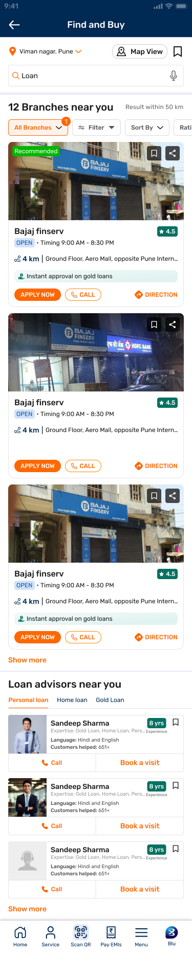

Entry
Eleven categories of coloured pin, no legend, no count and no radius. Whatever the customer arrived with is discarded at the door.
46.4% can't map a need to a category · richest source converts worst at 3.4%
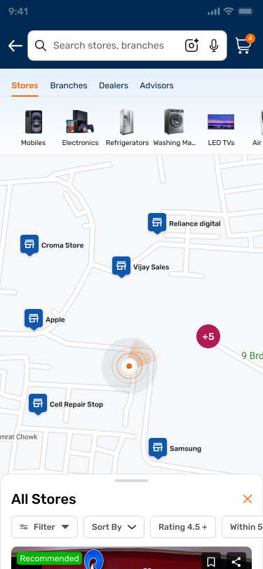
Named tabs by entity, a stated count and radius, an editable location, and product intents carrying the customer's own approved figure above the fold.
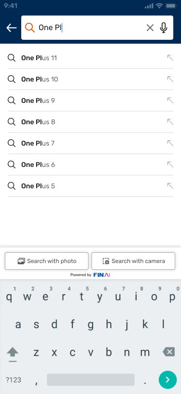
Search
It invites you to type, then returns silence. The index holds registered entity names, so Croma is filed as Infiniti Retail.
4.3 blank taps for every one typed · 70% of searchers hit a wall
Autocomplete from the second character. Brand synonyms, pincode, locality and vernacular. Voice, photo and camera. It can't return silence.
Results
Map-first, list hidden behind a floating button. One store at a time, so two shops can never be held side by side.
List converts 29–43%, map 7–9% · zero save or share clicks ever
List-first. Real storefront, rating, today's hours, distance and the offer at this branch. One primary action per card.
Decision
The card identifies a store. It can't enable a decision. No hours, no ETA, no phone, no photo, nothing about whether this shop takes a Bajaj card.
Depth 2/5 vs Google's 5/5 · 50% phone the store anyway
“Pre-approved offers for you — ₹40 lakh.” The customer's own limit, on a branch page, built from data the app already held.
80% preferred this to Google Maps once shown
The trip
The journey was designed to end at an address. Directions hand off, the session is over, and nothing is learned about the visit.
100% finish in Google Maps · 10% pay EMI at a branch, invisibly
The map stayed inside Bajaj. Named pins, clustering, a filterable sheet. Every card ends in Apply, Call or Book a callback, and the visit finally reports back.
Degraded
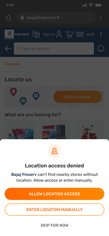
A modal you can't leave: no detected location, no city list, no skip, and an Apply button that fails contrast and never says why it's off.
100% who hit this did not return that session
Three real exits: allow, enter manually, or skip for now, with the reason in plain language. Where nothing is nearby, the answer is a wider radius, not a full stop.
The funnel moved in sequence.
Every tier moved, and moved in the order the strategy predicted — far harder to explain away than a single endpoint moving alone.
left without reaching store results
before
after
completed what they came for
before
after
arrive to resolve
before
after
right result on the first attempt
before
after
Session-level attribution, locator-originated only · matched like-for-like periods, excluding festive and campaign windows
A utility page became a routing layer into three P&Ls.
store & dealer visits
The metric closest to the original thesis. The EMI network stopped behaving like a backend asset.
lead generation
Raised from branch and loan pages, where the pre-approved limit now shows at the point of intent.
overall business
A branch-dependent product, so findability is the whole game. Making those branches locatable lifted the line.
Session-level, locator-originated attribution only · matched like-for-like periods, excluding festive and campaign windows · we claim the routing into each journey, not the product's own conversion.
Learnings, and what happens next.
I audited the screen before checking whether anyone used it.
The field study across eight agents was the cheapest method in the programme and the one that reframed everything. It ran in week four. It should have run in week one.
Bring the six businesses in before drafting a direction.
The five disagreements surfaced after I had a point of view. Had they surfaced first, the offers contract would have started a phase earlier, and it was the critical path for everything.
Position before polish.
Reordering the roadmap around adoption rather than interface was the decision the evidence forced, and the least popular decision in the room for an entire phase.
Anticipation, and who pays when we're wrong.
The app knows someone has compared phones for three days. Surface the store before the search. And if the savings are wrong, the app should carry the cost of the repair, not the customer. That is still open.
How AI was used across this programme.
Synthesis at speed
16 interview transcripts and 215 open-text survey responses coded for intent, anxiety and vocabulary. AI clustered; I decided what the clusters meant and checked every quote against its source.
LLM observability study
A structured 4Cs review across all eleven categories, plus competitive depth scoring against Google Maps, Justdial and CRED. It surfaced the hair-salon-in-healthcare failure I had not found by hand.
Options, not answers
Rapid variants for the decisional card and the degraded states, used to argue trade-offs faster in review. Every shipped pattern was chosen against a finding, not because a model proposed it.
Shipped to customers
Search now accepts voice and photo input, and an assistant answers product questions in-line. AI moved from how we worked into what the customer actually uses.
The rule I held throughout: AI compressed the time between a question and an option. It never decided which option shipped.
The proof isn't that more people found a store. It's that some of them no longer needed to.
That is what Discovery → Intent → Decision means once it stops being a strategy slide: sometimes the best fulfilment path is no trip at all.
Ashish Srivastava
Strategy · Service Design · UX | Bajaj Finance Limited